CAMP STELLA MARIS
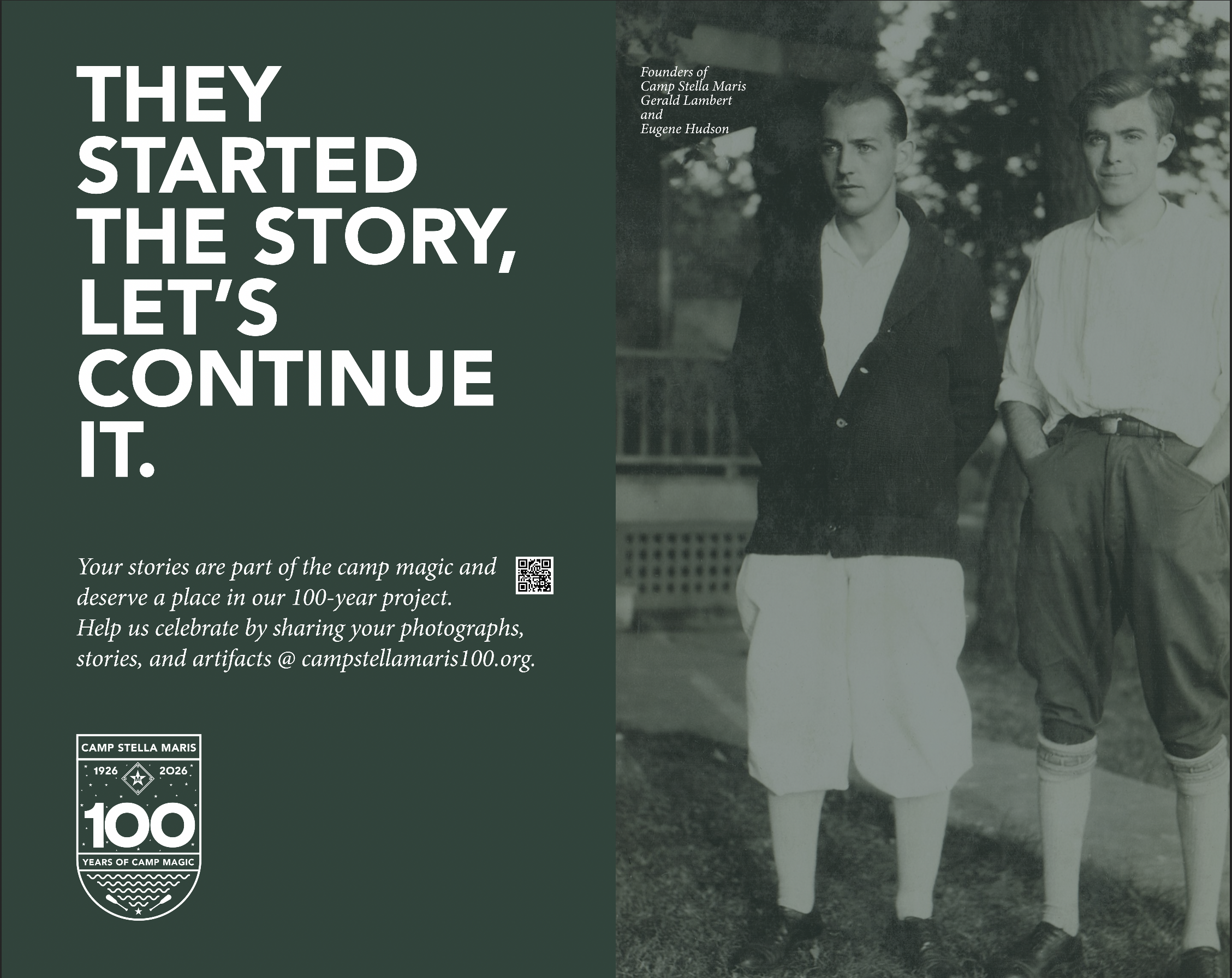
Camp Stella Maris is a nonprofit summer camp located on the scenic shores of Conesus Lake of the Finger Lakes. For over 100 years, it has provided a safe, welcoming environment for children to grow, learn, and create lasting memories. The camp offers a variety of activities, including swimming, canoeing, arts and crafts, hiking, and team-building exercises. With a strong focus on character development, faith, and community, Camp Stella Maris fosters independence, teamwork, and personal growth, all while giving campers a chance to experience the beauty of nature and make lifelong friendships.
PROJECT GOAL
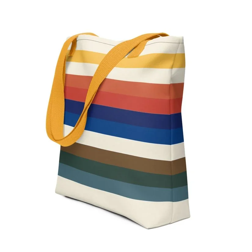
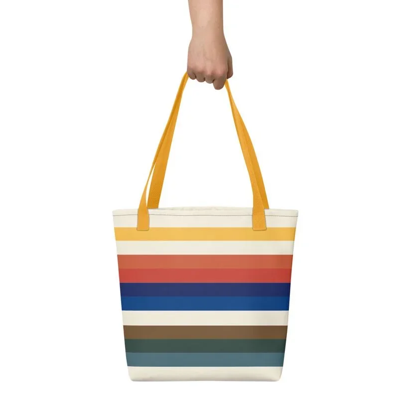
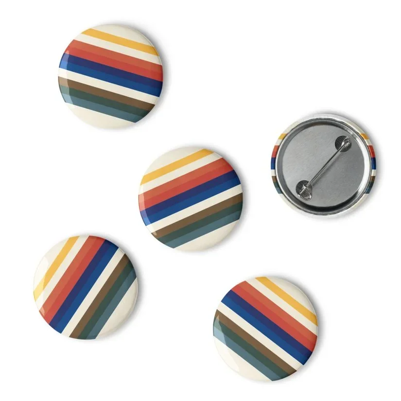
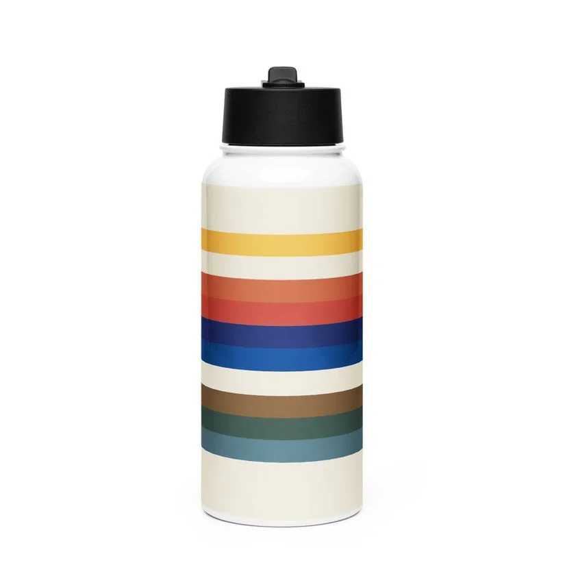
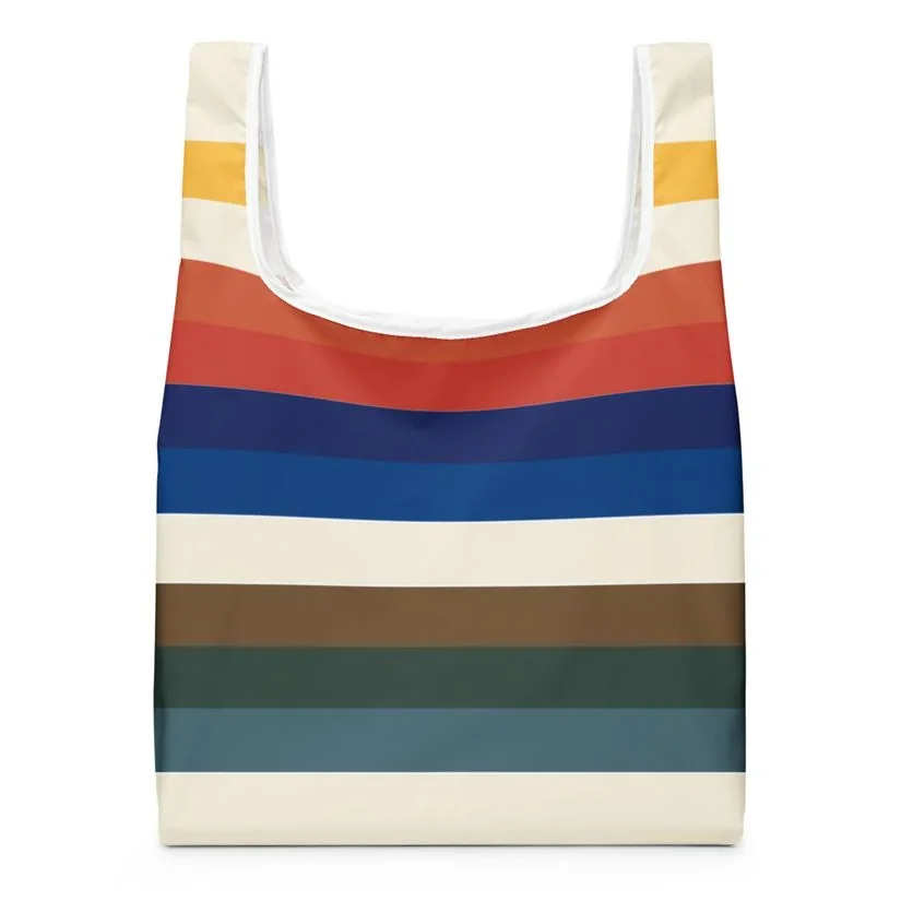
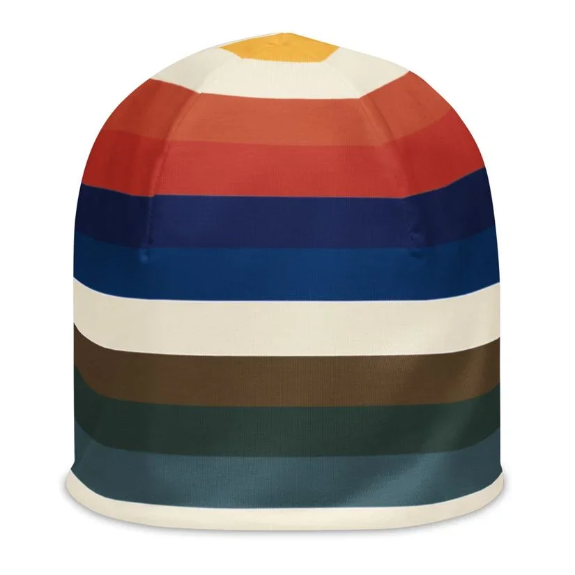
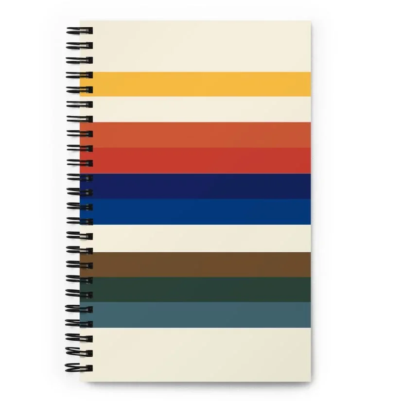
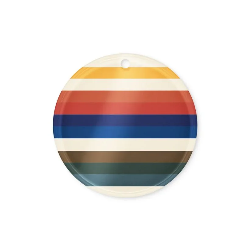
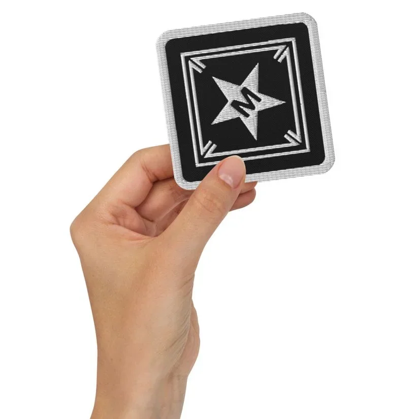
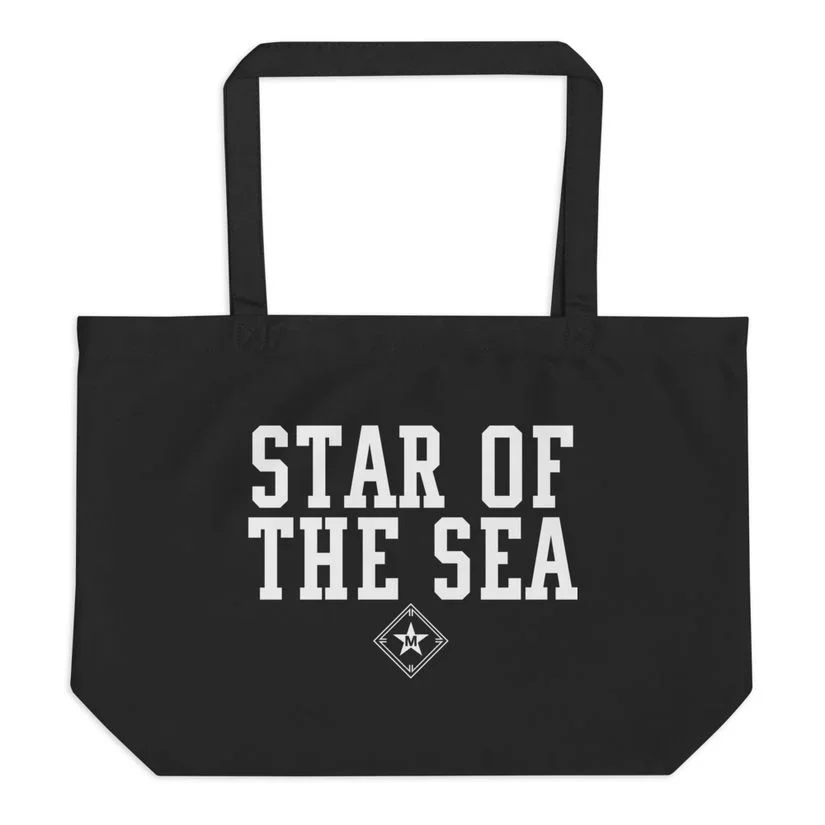
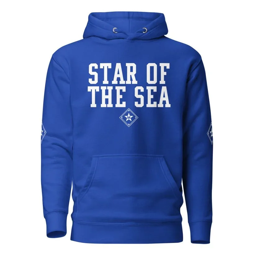
Camp Stella Maris is a place built on memory, belonging, and care, and the identity of some of its centennial celebration merchandise needed to reflect the same.
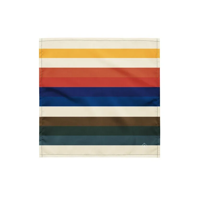
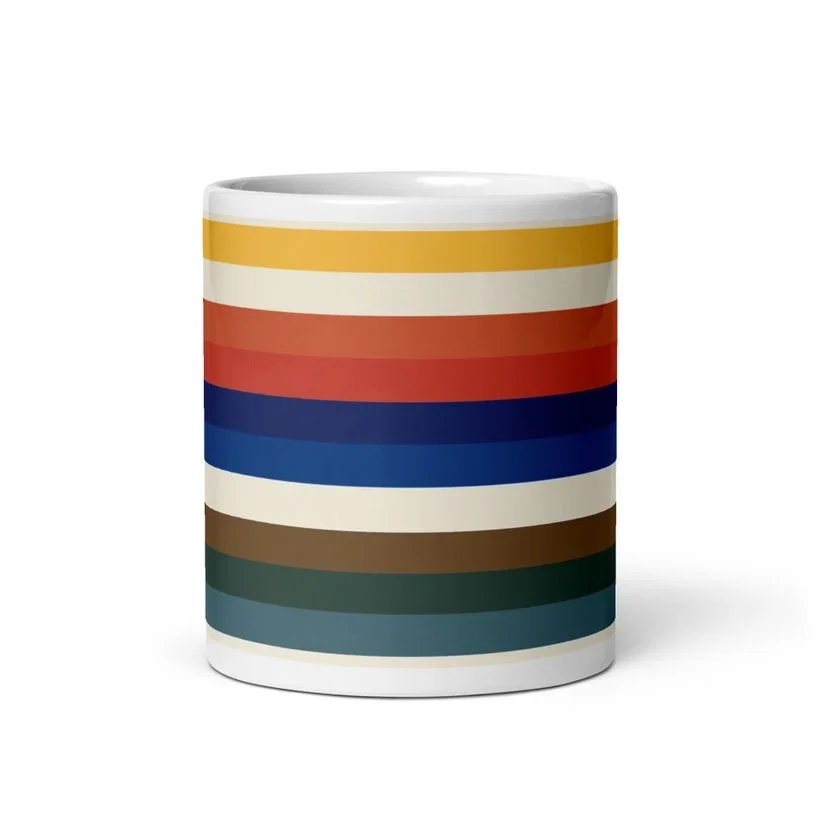
For this project, Pope Joan Design Studio created a visual language rooted not just in color, but in meaning. At the heart of the system is 143, the numeric shorthand for “I love you.” One letter. Four letters. Three letters. A simple code for connection.
That structure became the framework for the palette.
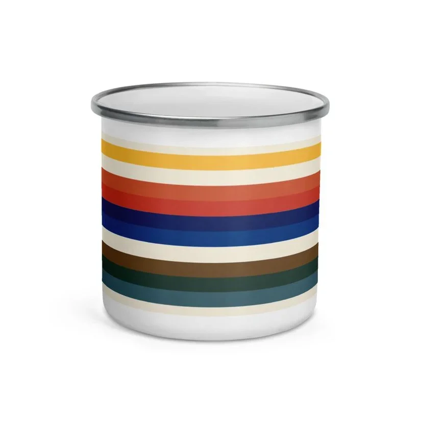
1 core branded yellow anchors the identity, warm, optimistic, and unmistakably camp.
4 reflects Camp Stella Maris’ branded colors along with life on the lake: orange life jackets and red kayaks.
3 grounded, natural tones pull from the cabins and landscape: Appalachian Brown, Hunter Green trim, and the shifting teal color of Conesus Lake.
All of it rests on Shaving Cream White, giving the brand space to breathe.
Rather than treat color as decoration, the system turns it into storytelling, balancing play with heritage, energy with calm, and nostalgia with clarity. The result is an identity that feels joyful, practical, and emotionally grounded, just like camp itself.
PROJECT OVERVIEW
Brand & Marketing Strategy
Book Design, Creative Direction, & Publication
Visual Identity
Merchandise Design
Print Collateral
Digital Collateral
Social Media Strategy
Website Design & Development